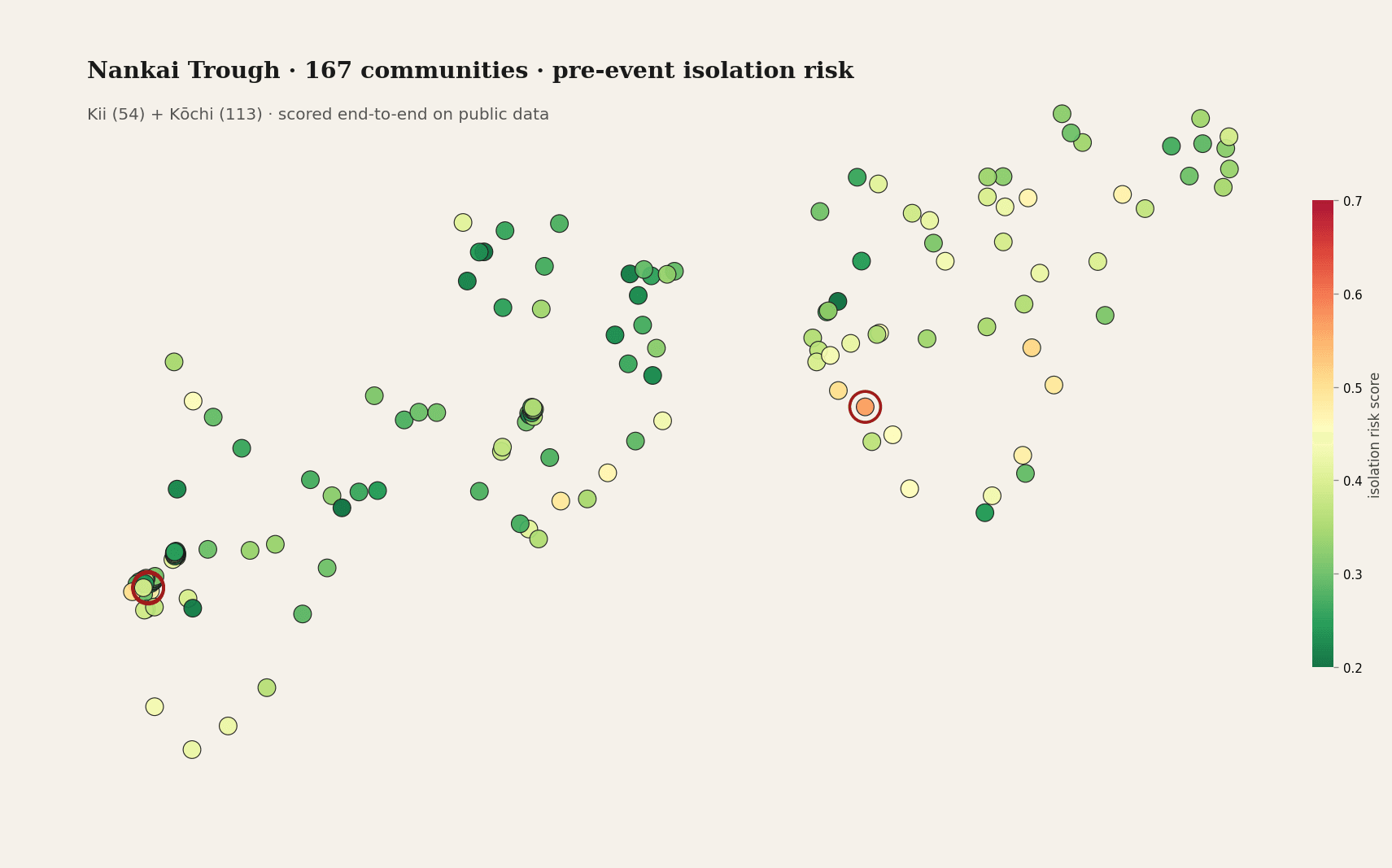
A research note on producing community-level isolation risk for the Nankai Trough scenario, from end to end on public data, with a 2024 Noto Peninsula retrospective as the credibility check that the method recovers a known answer on a known event.
The Nankai Trough megathrust is one of the events Japan's disaster infrastructure prepares for most explicitly. Cabinet Office scenarios estimate hundreds of kilometres of road network cut for periods running into weeks, and the operational question for a prefectural disaster-prevention division reads as a list, not a number: which communities will lose access first, through which bottleneck, and at what mitigation priority before the event. Existing prefectural surveys answer the first question at community granularity but are largely static, with many still based on 2013 voluntary returns. Modern hazard products (J-SHIS, 土砂災害警戒区域, GSI DEM) are dynamic and audited but tile-level. The work below sits in the gap between the two: a community-level, evidence-traced ranking, applied to 167 communities across 紀伊 and 高知 and tested on a recent event for which the answer is publicly known.
The first deliverable is an ordered list. Of the 167 communities in scope (紀伊地域: 三重 + 奈良 + 和歌山, 54 communities; 高知 + a small Tokushima tail, 113), the published pipeline returns 2 communities in the high tier, 41 in medium, 121 in low, and 3 in very_low. The 2 + 41 = 43-community shortlist is the immediate review queue for the four prefectures, sized so a typical disaster-prevention division can act on it within a single working week.
The second deliverable is the per-community decision card behind each line of that list. A card carries the isolation risk score (0-1), the tier, a one-line action class (from drone-survey confirmation of slope and road changes, through road-clearing-crew dispatch and structural inspection, up to long-term route-redundancy planning), a single-path-dependency summary (does the community in practice rely on one road in and out, and how many alternate routes the graph search found), the top bottleneck on the community's primary route (a named OSM way or bridge ID), and a clickable evidence pointer. Every score term traces back to the exact OSM road graph query, GSI terrain tile, e-Stat census cell, or hospital-catalog row that produced it. The full report containing the top-30 list, the per-prefecture top-10 lists, three GSI satellite-image chip walk-throughs, the drill-down on the top-ranked community, and the one-page methodology summary is published as a PDF in both English and Japanese.
The rest of this note describes the pipeline that produced these outputs, the credibility anchor we relied on, and a small side product: 13 access routes reconstructed from satellite imagery and submitted back to public maps as overlays.
The shape of the problem
A prefectural disaster-prevention officer planning for the Nankai Trough has to answer four questions before the event, not after:
- Which small communities (集落) are at structural risk of isolation?
- Through which specific road or bridge does each one's lifeline run?
- At what priority should a limited budget be applied to drone surveys, sat-phone deployment, supply pre-positioning, and BCP revisions?
- Where is the public road dataset incomplete enough that the official picture understates how isolated a given community really is?
The available inputs that answer these questions live across several authoritative sources. The OSM road graph carries the network topology and supports a graph-cut analysis of which edge falls produce which downstream isolation. The Cabinet Office maintains a list of past isolation events and publishes 2025 inundation forecasts for the South-Sea Trough scenario. MLIT's 国土数値情報 includes the 急傾斜地崩壊危険区域 polygons and the hospital catalog with surgery capability. GSI publishes the 5m DEM and the orthophoto tiles that make community-level visual analysis possible. e-Stat's 2020 census provides per-block aging rates.
None of these, on its own, ranks communities. The work is in the integration: bringing the road graph, the hazard polygons, the elevation rasters, the demographic data, and a visual reading of the local terrain into the same per-community decision frame.
What this work produces
The published artifacts are concrete and small.
- A 167-community risk ranking across 紀伊 and 高知. Tier distribution: 2 high, 41 medium, 121 low, 3 very_low. The 43-community medium-or-higher list is the practical review shortlist.
- A per-community decision card for each community, with risk score, tier, action priority class, single-path-dependency summary, top bottleneck, and an evidence-trail pointer.
- A 2024 Noto Peninsula retrospective in which the same pipeline (applied to the 35 small communities in the affected area) recovers 22 of the 26 actually-isolated communities in the top-26 of its ranking. The actually-isolated list is published by Cabinet Office and each affected prefecture, so the retrospective is third-party verifiable.
- 13 reconstructed access routes (紀伊 6 + 高知 7) added as map overlays. These are small access routes (林道, 農道, 私設橋) that the OSM road dataset does not carry but that change the operational picture for the communities they connect.
- A click-traceable evidence UI, with every score term reachable to its underlying raw query.
- A PDF report in English and Japanese.
The PDF carries the full top-30 list, per-prefecture top-10 lists, three GSI satellite-image chip walk-throughs with the five-dimension visual read-out per chip, the drill-down card on the top-ranked community, a one-page methodology summary with the per-signal weight table and 90 % uncertainty bands, and the figures behind the credibility section.
Approach: Contextual Agentic Vision applied to community-level isolation
The pipeline is built as a contextual agentic vision analysis: specialist scouts read public imagery, a context pack carries the public spatial data, a deterministic orchestrator combines the scout outputs into an explicit weighted-sum score, and every score is backed by an audit trail. Each part is small enough to describe in a paragraph.
Specialist scouts. A vision-language model reads each community's GSI orthophoto chip with five purpose-built specialist prompts that ask the questions that distinguish at-risk communities from low-risk ones: coastal exposure, single-road visibility, terrain lockedness, infrastructure sparsity, and a holistic isolation read. Each prompt returns a score in [0, 1] with a one-line finding. The five are averaged into an aggregate visual-imagery signal. The full five-dimension read-out per community is stored alongside the chip; readers of the PDF see three worked examples (a topology-driven high-tier hamlet, a tsunami-driven coastal town, and a low-tier control) with the chips and the read-outs side by side.
Context pack. Seven public sources feed the per-signal raw values: the OSM road graph (with bridges and tunnels), the GSI 5m DEM, MLIT's 急傾斜地崩壊危険区域 polygons, the e-Stat 2020 census, the MLIT hospital catalog, the Cabinet Office historical-disaster archive, and an internally computed tsunami exposure proxy (community elevation × distance to OpenStreetMap coastline). Every signal is the result of a quantitative reading of one of these sources, not an opinion.
Reasoning orchestrator. A deterministic Python pipeline aggregates scout outputs through retrieval functions, runs a graph-cut analysis on the local road subgraph to identify each community's most fragile primary-route edge and the consequence of its removal, and combines all signals into a final score via an explicit weighted sum. No black-box predictor sits between input and output. The score formula is published, the weights are published, and the formula is invertible: a community's score moves predictably when a new road opens, a hospital closes, or a flood-zone polygon is updated.
Evidence chain. Each per-community decision card is backed by an append-only JSONL trace of (function, input, output, timestamp) quadruples, replayable end-to-end and readable without ML expertise. The audit trail is what makes the unit of output here not a label, but a decision card with its evidence chain attached.
Weight provenance. The per-signal weights are derived by a Bayesian fit on the 2024 Noto Peninsula retrospective (the Noto-fitted weights). For the Nankai forward predictions the weight set is adjusted to reflect the tsunami-driven mechanism of the scenario: Cabinet Office 2025 inundation forecasts put tsunami inundation at the centre of the South-Sea Trough casualty estimate, so the forward weight set raises the tsunami-exposure weight and lowers the visual-imagery weight relative to the empirical Noto fit. Both weight sets are documented in the PDF; readers who want the per-signal posterior bands can find them there.
Ranking the Nankai zone
The 167-community set is the intersection of three filters: (a) communities small enough that isolation is a structural risk (typical population under a few thousand), (b) inside the Cabinet Office's South-Sea Trough scenario area, and (c) public-data-resolvable end to end (centroid, road context, demographic block, hospital catalog reachable).
The score composition follows the three-tier signal grouping the PDF uses:
- Mechanism-central signals (about 70 % of the score). Tsunami exposure (weight 0.21), single-path dependency (0.18), landslide hazard zone overlap (0.17), and graph-cut severity on the local road subgraph (0.15). Tsunami exposure carries the largest weight because the Cabinet Office 2025 forecasts make tsunami inundation the dominant isolation driver along the Pacific coast of 和歌山 south and 高知 south. Single-path dependency captures coastal lifeline vulnerability, where a single trunk road runs between an exposed community and the rest of the network. Landslide hazard and cut severity carry the topological side of the same picture.
- Context signals (about 20 %, used as evidence cross-checks). The visual-imagery signal (0.11), terrain slope (0.07), and historical-disaster count (0.05). Visual imagery is weighted moderately rather than maximally on the Nankai forward predictions, since the visual cues that work for an earthquake event are not guaranteed to transfer to a tsunami event; the visual signal is more credibility-supporting than score-driving here.
- Background signals (small weight, for explanation). Aged-population share (0.04) and distance to nearest surgery-capable hospital (0.02). These are present so the per-community decision card can surface the vulnerable-population picture and medical-evacuation distance to the officer reading the card, even though they are not the main drivers of the rank.
Bottleneck ranking on the local road subgraph gives the second-most-actionable column in the report, after the rank itself: for each community, the OSM way ID (or bridge ID) whose removal would cut the community off from the regional hub network, and the count of additional communities that share that same critical edge. A chokepoint named twenty times across the 167 cards is the kind of mitigation target that justifies a single road-redundancy or bridge-reinforcement investment.
The top of the list is concrete enough to verify locally:
| Community | Prefecture | Score | Tier | Population | Aged 65+ |
|---|---|---|---|---|---|
| 煙硝蔵 | Kochi | 0.65 | High | 234 | 65% |
| 御殿内 | Kochi | 0.63 | High | 405 | 59% |
| みなべ町 | Wakayama | 0.56 | Medium | 495 | 25% |
| 先新浜 | Kochi | 0.55 | Medium | 278 | 39% |
| 花組 | Kochi | 0.55 | Medium | 388 | 35% |
煙硝蔵 and 御殿内 are mountain hamlets on narrow valley roads (single-path dependency and landslide hazard dominate their scores); みなべ町 is a coastal town where the tsunami-exposure signal pushes the rank up despite the local road network being well-connected. The PDF includes the full top-30 with hospital-distance and bottleneck-edge columns, plus the per-prefecture top-10 lists for officers who only need their own jurisdiction.
Method credibility: the 2024 Noto retrospective
A predictor for an event that has not happened cannot be tested against itself. The strongest credibility check available is to apply the same pipeline to a recent event where the answer is publicly known, and ask whether it recovers what it should have predicted.
The 2024 Noto Peninsula earthquake provides that test. Cabinet Office and the affected prefectures published the list of communities that were actually isolated. Across 35 small communities in the affected area, 26 are on that list.
Applied to this cohort, the pipeline's top-26 ranking by isolation risk score recovers 22 of the 26 actually-isolated communities. Of the four miss-ranked, three sit in the immediately-below tier, not deep in the long tail of the distribution.
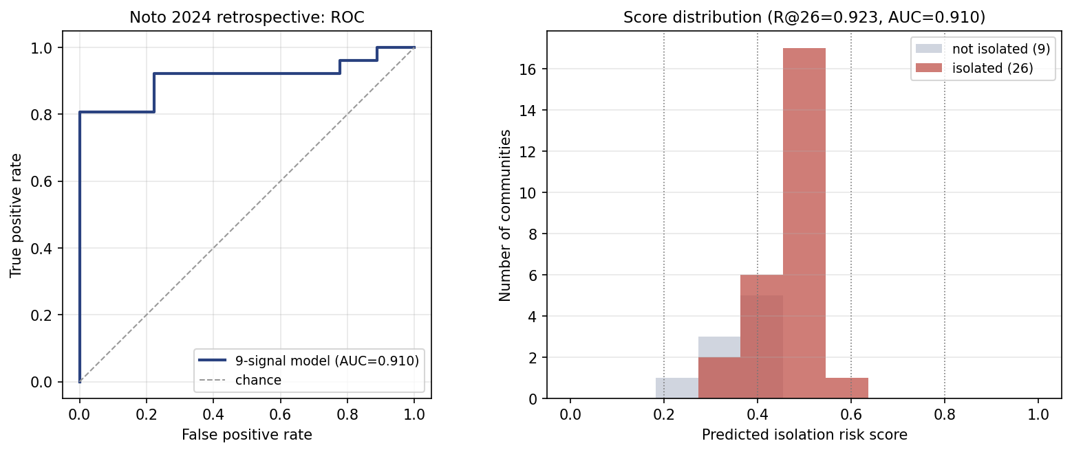
This number is in-sample. The weights used in the Noto retrospective were fit on the same Noto cohort, which is why we frame the retrospective as a credibility check rather than a held-out validation. The framing matters because the Nankai forward predictions are not derived by running the Noto-fitted weights on Nankai data verbatim; they use a Nankai-mechanism-prior weight set that reflects the tsunami-driven character of the scenario. The Noto retrospective tells the reader that the signal selection, the graph-cut analysis, the visual-imagery prompts, and the audit-traced aggregation work as a unit on a real Japanese earthquake. The Nankai release uses that demonstrated machinery, with a weight set that the Cabinet Office's 2025 mechanism forecasts ask for.
Reconstructing the access routes that aren't on the map
A separate but related finding came out of the per-community evidence pass. Many of the small communities in scope rely operationally on access routes that are not in OpenStreetMap. 林道 (forestry roads), 農道 (agricultural roads), and 私設橋 (privately-maintained bridges) are routinely missing from the public road dataset, because they sit across cross-agency 台帳 records and no single party maintains them in OSM-compatible form. For isolation planning, the gap is real: a community appears single-path on OSM but in practice has a forestry track that runs over the ridge to a neighbouring valley.
A separate route-reconstruction pass produces these from GSI orthophotos. The pipeline takes a chip of the community's surroundings, runs a vision-language pass with a path-detection prompt, and emits GeoJSON for any segment the model identifies, with endpoints snapped to the nearest OSM node where possible. Across the 167-community Nankai scope, the pass produced 13 reconstructed segments: 6 in 紀伊 and 7 in 高知. Each is visible as an overlay in the per-community decision UI; submission of validated segments back to OpenStreetMap is the natural next step.
How the reconstruction was actually produced is worth noting: the pipeline writes pending vision-model requests as JSON files on disk, then reads responses written back into the same directory. Any vision model can fill those requests in, whether a hosted API (Anthropic Claude, OpenAI, Google Gemini), a self-hosted model, or a human-in-the-loop reviewer. For this report, the path-detection prompts were answered by Claude Code reading the GSI chips directly from disk, which means the full reconstruction trail can be reproduced without any API key.
Forward
The same pipeline pattern (specialist scouts plus context pack plus deterministic orchestrator plus audit trail) applies to other community-level decision problems where a labelled retrospective event is available to anchor the weights. Flood-driven isolation, sediment-disaster susceptibility, and facility-resilience analyses are the natural next applications.
A post-event re-ranking mode is already implemented on the same engine. It updates the same community decision cards as MLIT 道路復旧 reports arrive after an event, scrubbing the time axis from the first 6-hour snapshot through to "everything restored". The use case is the disaster-prevention staff member running a shortlist during recovery operations, not a separate tool.
自治体 pilots are open for integrating the per-community card stream into a 防災 BCP cycle, particularly for the four prefectures in scope here. Independent expert validation by 1-2 土木 reviewers on a sampled subset is in progress, to complement the in-sample Noto retrospective with external plausibility scoring.
Where this leaves community-level disaster ranking
The structural claim worth taking from this work is about the unit of output. A prefectural disaster-prevention division does not need a single number representing how bad the next earthquake will be. It needs an ordered list of communities at granularity it can act on, with the evidence chain attached to each line, in a form that fits the existing weekly review cycle. The 167-community Nankai ranking, together with the 22-of-26 recovery on the 2024 Noto retrospective, is one data point that such a unit can be produced from public data, with the audit trail running down to the OSM query that produced any contested score. The more interesting open questions are about which other community-level decisions, recovery prioritisation, evacuation planning, infrastructure investment, the same unit serves, and which additional signals belong in the context pack for each.
The full PDF report, with the top-30 list, per-prefecture views, three satellite-image walk-throughs, the drill-down card, and the per-signal weight table, is available in English and Japanese below.
Download the full report
- 📄 Community Isolation Risk: South-Sea Trough Scenario (English, ~28 pages, 2.7 MB)
- 📄 集落孤立リスク:南海トラフ巨大地震シナリオ (日本語版、約26ページ、5.1 MB)
Both versions cover the full 167-community ranking, the 2024 Noto retrospective figure, three GSI satellite-image walk-throughs, a worked drill-down on the top-ranked community, and the per-signal weight table with uncertainty bands.